A good day often starts with a good night’s sleep. Sleep Number takes this responsibility seriously – and they know it doesn’t look the same for everyone. Their smart beds automatically sense and adjust to the needs of each sleeper by balancing temperature, firmness and contouring throughout the night.
As the exclusive designer, manufacturer, marketer and retailer of their products, Sleep Number provides every customer with a seamless end-to-end experience. It’s this personalized yet cohesive experience they strive to deliver for their employees, who they call team members, too.
Sleep Number employs over 5,000 people in corporate, manufacturing, sales, customer service and field service roles. For many years, the company had been trying to meet these diverse employee needs with four different intranets – one of which was The Wink, a classic SharePoint intranet built on Habanero’s GO platform in 2016. As their needs continued to grow over time, they struggled to effectively manage content across four platforms.
It was time to consolidate the sites and bring everyone together with a unified intranet experience. With classic SharePoint nearing end-of-life, a move to modern SharePoint was the next natural step and partnering with Habanero again made sense.
From four sites to one
The Wink largely focused on corporate and manufacturing users, who represent a quarter of Sleep Number’s employees. It wasn’t the only site that needed to migrate to the new platform. Employees in sales, customer service and field service each had their own intranet built with an out-of-the-box SharePoint product. Each of these sites was managed by internal teams to support a different audience and use case:
- Sales teams work in Sleep Number stores directly with customers. They accessed their site primarily on desktop, though tablet use is growing, which has underlined the need for an improved mobile experience.
- Customer service teams work in the customer relations call centre. They were heavy desktop users of their site, using it to answer questions and troubleshoot issues with beds and equipment.
- Field service teams deliver and install beds in customers’ homes. Since they’re on the go all the time, they needed a strong mobile experience with this upgrade.
“The Wink was our gold standard experience,” says Kelsey. “It was closer to what people expected to see in their personal lives, whereas the other sites were less visual and engaging.”
The three other sites looked similar to each other, and there was a lot of content overlap and inconsistent terminology. Unsurprisingly, this created confusion for employees and cast doubt on the accuracy of information. The move to SleepLife was a good opportunity to clean up the content and create a single source of truth that everyone could trust.
Product Hub
Product information was a core content area for all of Sleep Numbers’ team members. Most of them needed to access this information, but they each had unique needs.
“Thousands of product pages and content were duplicated across all three sites, since each operational group used the information differently,” explains Habanero Product Manager Ryan Bender. “An employee on the customer service team might look up a product to troubleshoot an issue, the sales team might check product specs for customers, and the field service team might only be interested in installation procedures.”
Some of this content was managed centrally, while other parts were managed separately on each site, so it was inevitable that inconsistencies would arise over time. The path users took to navigate to the product information also differed across each site, which caused confusion among the groups as to how and where the information was available.
Making the move to modern SharePoint offered the perfect opportunity for Sleep Number to create a Product Hub that consolidated all product information into a single source of truth that could be easily managed in a central location.
To achieve this goal on SleepLife, the team created consistent navigation and page layout and established a shared terminology to make it easy for employees to find the information that’s important for them. They also improved product metadata to ensure employees who are browsing and searching for product information receive reliable results. And now that all the product information lives within a single platform, it’s easier to keep the content accurate and up to date.
Personalized content within a unified experience
Before the launch of SleepLife, employees had different intranet experiences depending on what team they belonged to. Many of them didn’t have The Wink as their homepage and didn’t engage with it often. People questioned why their experiences didn’t match others.
With the move to modern SharePoint, the team wanted to deliver a tailored experience that would also be broad and inclusive to everyone in the organization.
“It was important for us to create an experience where everyone felt valued equally,” says Kelsey. “At Sleep Number, we believe that good ideas – and great people – are everywhere. It’s not dependent on the department that you’re in. This is an important part of our culture and so it was top of mind for SleepLife.”
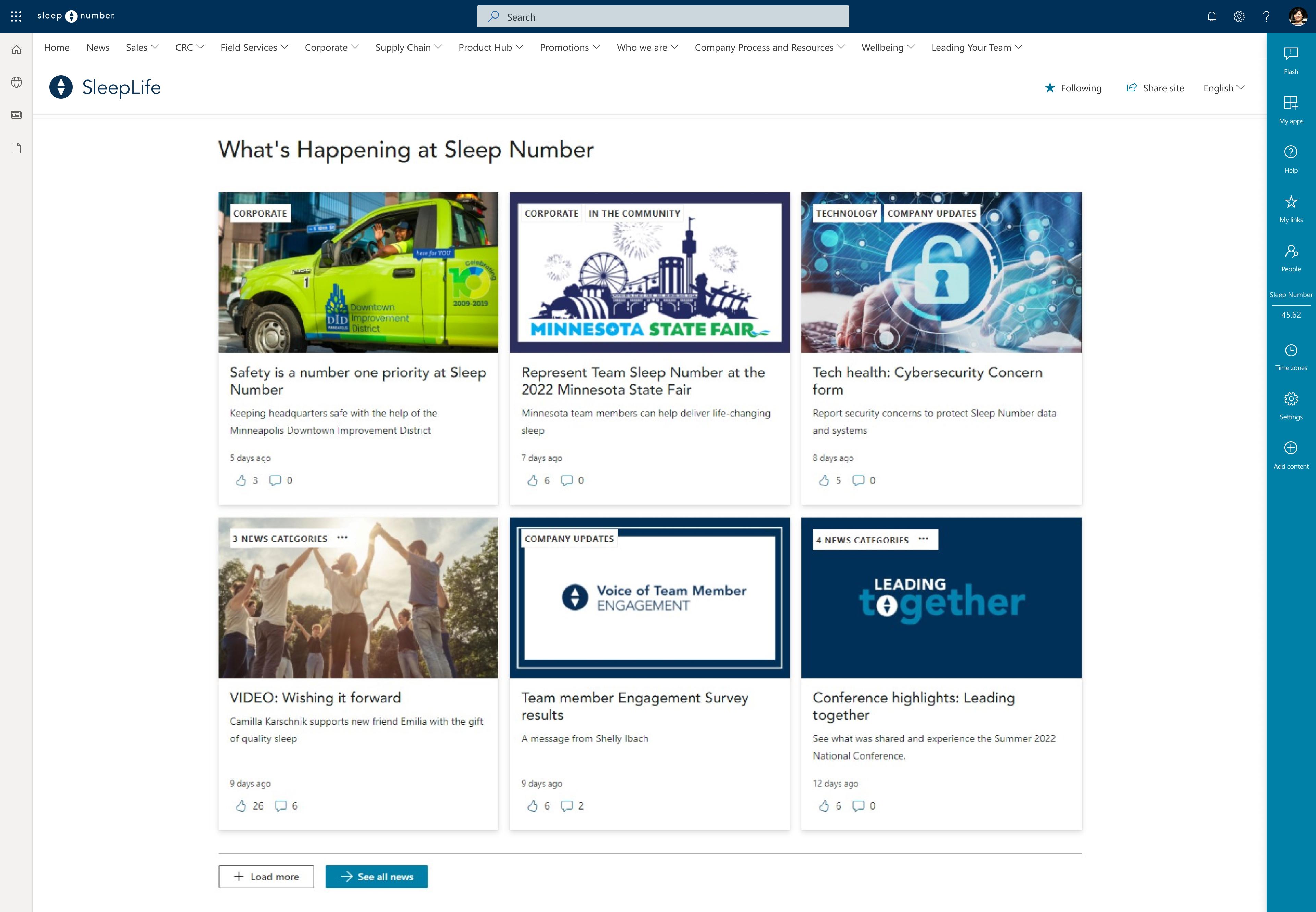
Thanks to the employee groups and permissions set up by Sleep Number’s internal IT team – and the capabilities of GO Intranet for modern SharePoint – employees can now curate the news they want to see.
Permissions
As a modern SharePoint intranet, SleepLife consists of multiple site collections. Their internal IT team set up permissions to make groups available tenant wide. This ensures the groups are easier to maintain and reuse. It also allows them to take advantage of SharePoint’s audience targeting capabilities.
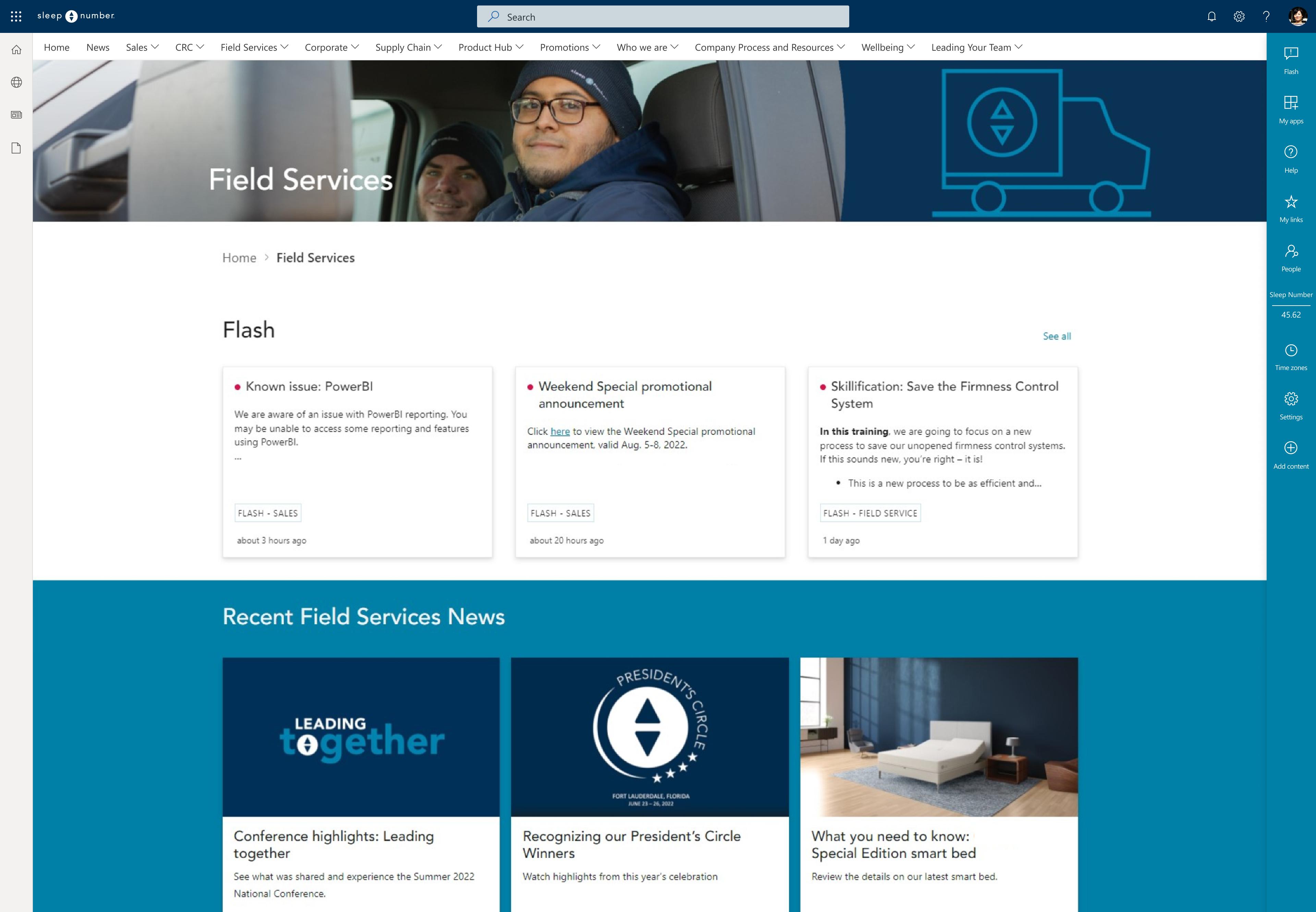
On SleepLife, this shows up in the navigation. Sales, customer service, corporate, supply chain and field service teams each have their own landing page that only appears in the menu for employees who belong to those groups. Leaders have their own permissions-based site collection where they can access resources.
Now each employee can easily find the information that’s most relevant to their role. At the same time, they still have access to everything on the site.
Shortcuts
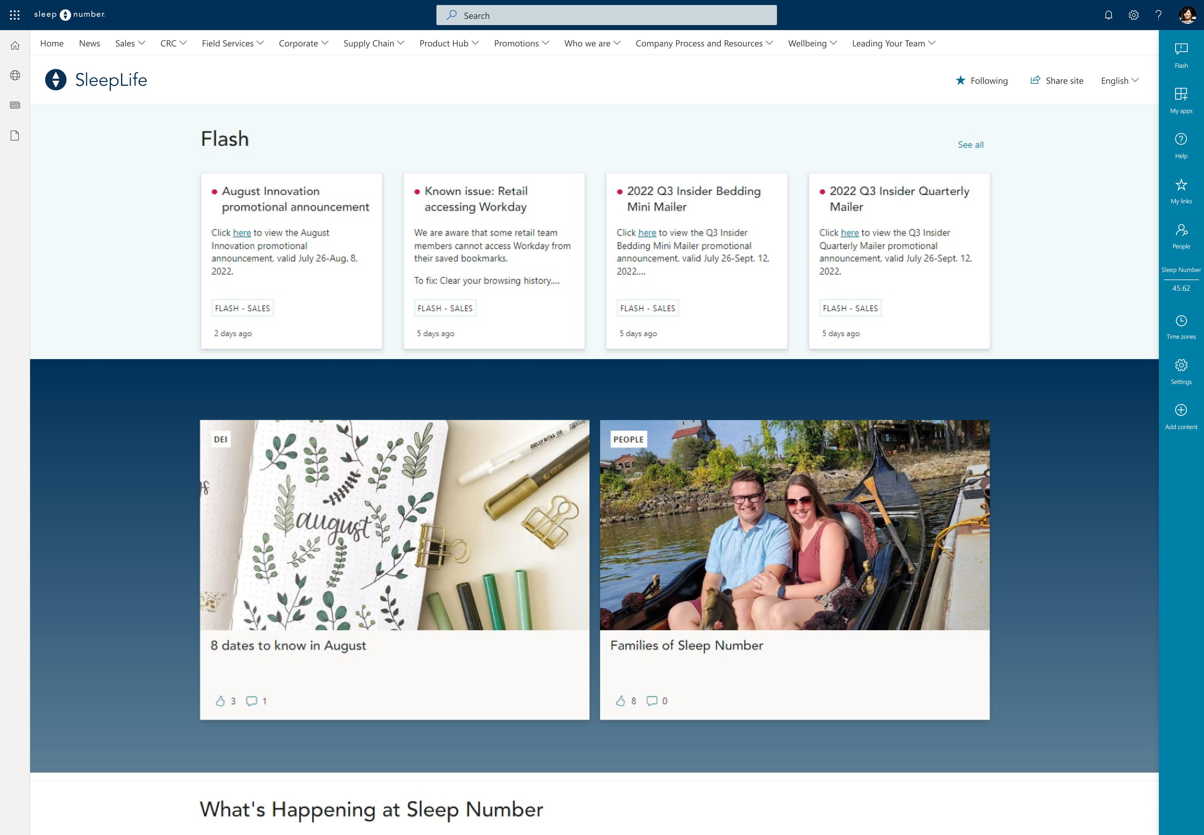
The shortcuts bar sits on the right side of every page of SleepLife. An employee can click to expand it if they want to access apps, find quick links, get help or check other time zones.
“It seems like such a small thing, but these items are there for everyone,” says Kelsey. “That consistency is helpful.”
Employees can also go to the bar to customize their intranet experience and select what content they want to see.
“We mandate a few categories, but for the most part it’s up to them to decide,” says Kelsey. “If something doesn't apply to their role, or they’re not interested in it, they don’t have to see it.”
News
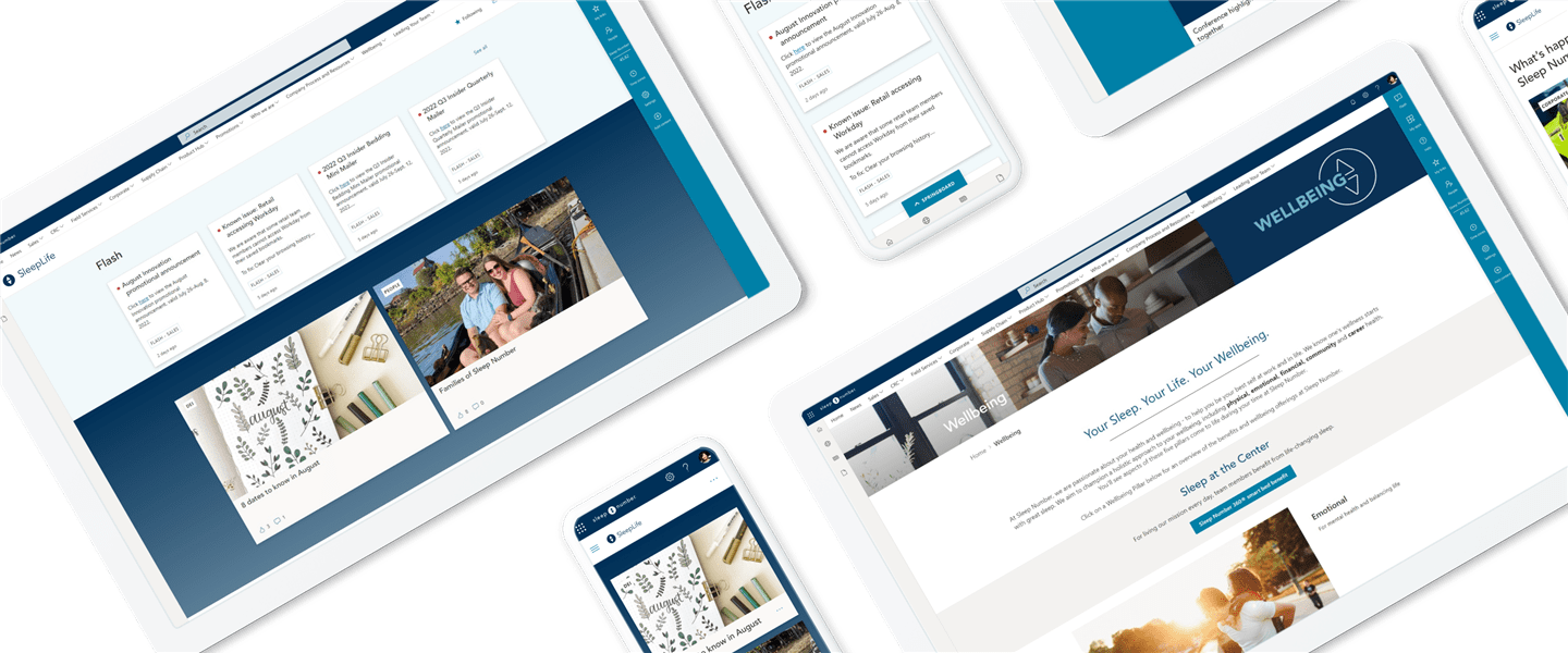
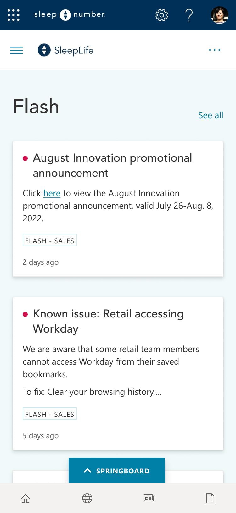
In addition to their standard news items, Sleep Number publishes flash news. These time-sensitive updates alert employees to information they need to do their job. Employees might receive a flash news item about a special sale or a system outage. Before SleepLife, if a flash news item was relevant to everyone in the organization, it would need to be published on three different sites in order to gain full exposure. Now it’s posted once and appears for everyone who needs to see it.
To improve the experience of flash news on SleepLife, the team used GO’s announcements web part, which can be targeted to specific audiences. When a new item is posted, a red dot appears in the springboard to notify the user that an update is waiting to be read.
“This was a cool enhancement that we didn’t have in classic SharePoint,” explains Kelsey. “If you’re a salesperson, you’ll see sales notifications, and the red bubble will show up in your shortcuts bar, which follows you everywhere on the site. But if you’re in manufacturing or field services, you won’t see the notification, because the news isn’t relevant to you.”
Modernization and migration – two steps in the journey
The terms modernization and migration are often used interchangeably, but they're distinct activities that require different preparation. Modernization is the act of converting classic publishing pages to the modern SharePoint page architecture, while migration is the act of moving files documents images and list items to the new modern sites.
“Modernization isn’t as simple as moving your content pages from the classic page library over to the new modern site page library and expecting them to work,” says Ryan. “You need to plan for how some of your current functionality translates into the modern experience. Because The Wink was on our classic version GO, we had a good sense of what the experience would be like in the new modern version of GO. Planning for the functionality of Sleep Number’s other sites took extra consideration.”
To understand the scale of the modernization and migration the team was facing, it helps to know that The Wink consisted of 700 pages and the other three sites together contained 3,000 pages, 12,000 documents and 3,000 images.
Together, Hab and the Sleep Number team migrated about 90% of content from all the old sites to SleepLife.
Design made easy
Once the pages were moved to the new platform, the team manually inspected the pages to clean up any formatting that didn’t map over perfectly. In some cases, they chose to rebuild pages because they wanted to completely rethink the content and take advantage of the new web parts available to them.
“We spent a lot of time asking ourselves how we could use the web parts available in modern SharePoint in a brand-new way that feels fresh and livens up the site,” says Kelsey. “We didn't want to do a full lift and shift, where it looks exactly the same. We wanted it to look new, especially the things that are seen company wide.”
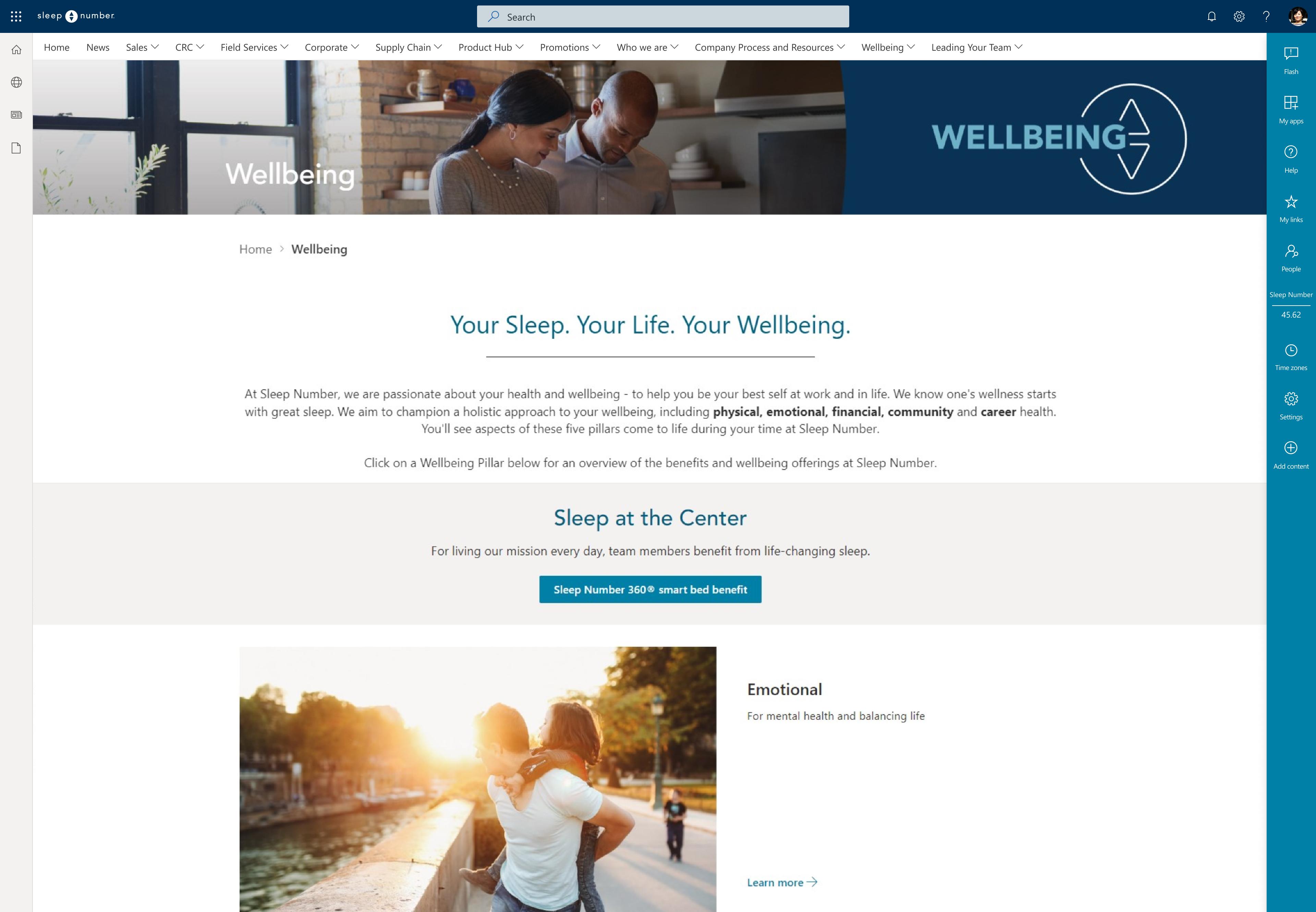
Sleep Number’s employee wellbeing program is an example of how Kelsey’s team was able to create the kind of digital experience employees were used to seeing on consumer websites and had come to expect even in their work lives. What was once a basic content page with accordions is now a highly visual landing page that provides a seamless experience users want to explore.
“The platform is so user friendly,” says Kelsey. “We produced this beautiful site and you wouldn't know that we're not designers. I'm proud of how our team was able to experiment, get flexible and dive into the unknown without having to worry about breaking something. It’s given us the ability to let people expand what they can do.”
Sleep Life belongs to employees
The Sleep Number team prepared a robust launch plan that started almost two months prior with departmental and leader meetings. When the go-live date arrived, the process went smoothly, thanks in part to the collaborative and supportive relationship they had with the Habanero team.
For two weeks afterwards, they provided on-demand support, along with an open Microsoft Teams site where anyone could post issues or share feedback, questions and suggestions. Employees have been taking advantage of it, a sign to Kelsey and her team that they’ve embraced the site.
“It’s a great feeling,” she says. “The thoughtfulness of the feedback we’ve received shows that they feel the site belongs to them. And they see it as a way for their voice to be heard and a tool to help them in their job.”
This engagement is showing up their analytics as well. Now that employees aren’t siloed off into separate sites, usage for Sleep Life has taken off. Kelsey describes the analytics available within GO as a one-stop-shop: “I don't have to dig through Google and apply filters. I can see the story the analytics are telling.”
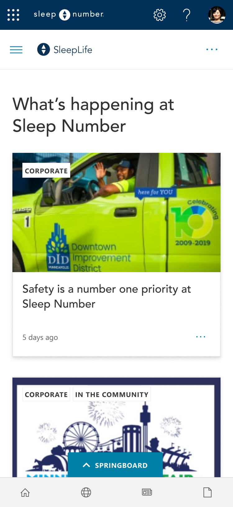
One of those stories is that employees are engaging with the improved mobile experience. SleepLife is now available as the first tab in their mobile Microsoft Teams app company wide. Corporate users are increasingly accessing information on their phones, especially in a hybrid environment, and the field services team works entirely on their phones, so this is an important upgrade.
"We want to make sure we’re reaching our users where they are and being as helpful as we can be,” Kelsey says. “Making the site available within Microsoft Teams has removed one more app that people have to navigate to and sign into.”
While SleepLife is now the go-to place for employees to find the information they need to do their jobs, it also helps them to connect with each other across teams in new ways.
As part of the company’s step challenge in support of the American Cancer Society, employees were invited to upload photos to a gallery on the SleepLife homepage. People had the opportunity to see themselves on the site and get to know their coworkers.
For Kelsey and her team, this is just the beginning.
“I’m excited to see how people use it. It’s still pretty fresh,” she says. “How will they take advantage of the different features? I love hearing that people are excited to use it and have it at their fingertips.”


