“The intranet isn’t just a place for information about holidays and special events,” says Daniela Marchetti, GTAA’s manager of digital and corporate solutions. “People use it as a work tool. They need it to do their jobs.”
GTAA’s former intranet posed serious challenges, including no search and no set taxonomy, often leaving users disoriented and frustrated. Having seen Habanero’s empathetic, user-centric approach on other collaborations, GTAA turned to us to design an employee-supportive intranet experience.
“Employee satisfaction is just as important as passengers’,” says Daniela.
Lift off
The GTAA opted to build their new intranet on GO, our customizable SharePoint intranet that can launch in as little as 10 weeks.
“In past lives I’ve redone intranets, and the typical project length is 18 months,” says Erik Olaveson, GTAA’s manager, digital experience. “That timeline was just not feasible.”
While the GO timeline is short, the product is flexible. “Some organizations assume that an out-of-the-box product will limit or constrain them,” says Kurtis Beard, Habanero’s creative director. “But because of how we’ve built GO, we don’t have those constraints.”
Daniela underscores the same point: “We didn’t skip the human-centred design. We went out to users to understand their goals and the jobs they’re trying to do, and that’s what our intranet is designed around.”
A digital destination defined by employee needs
In the immersive research that kicked off the project, we discovered several important digital-experience needs.
-
Diverse roles translate to diverse information and usability needs
According to Daniela, “We don’t have a bunch of people sitting at desktops. We have different user groups. We have super-users and non-super-users. We have people who deal with planes all day long and others who don’t see aircraft day-to-day.”
-
Constant change needs to be communicated quickly
Ricardo Ramirez, Habanero’s lead analyst on the project, says that “what we observed is that the airport is constantly changing, and people need to understand how those changes impact their operation. People here need a clear picture of what has happened across the airport in the last 24 hours.”
-
People want to know what’s happening at Pearson, but they don’t have a lot of time
“We wanted to build a sense of place and pride,” says Erik. “That was one of the major findings in initial discovery. Many people are proud to work here, and they want to know what’s going on. But finding time is hard, so it’s important that we make news easy to find and digest.”
“We were genuine, intentional, and careful about every design decision we made,” says Kurtis, who recalls the moment he shared the mock-up with the GTAA team. “When we revealed the mock-up, the brand manager was giggling. I suddenly got nervous that I had made a huge mistake. But she was laughing out of sheer joy. That was an incredible moment.”
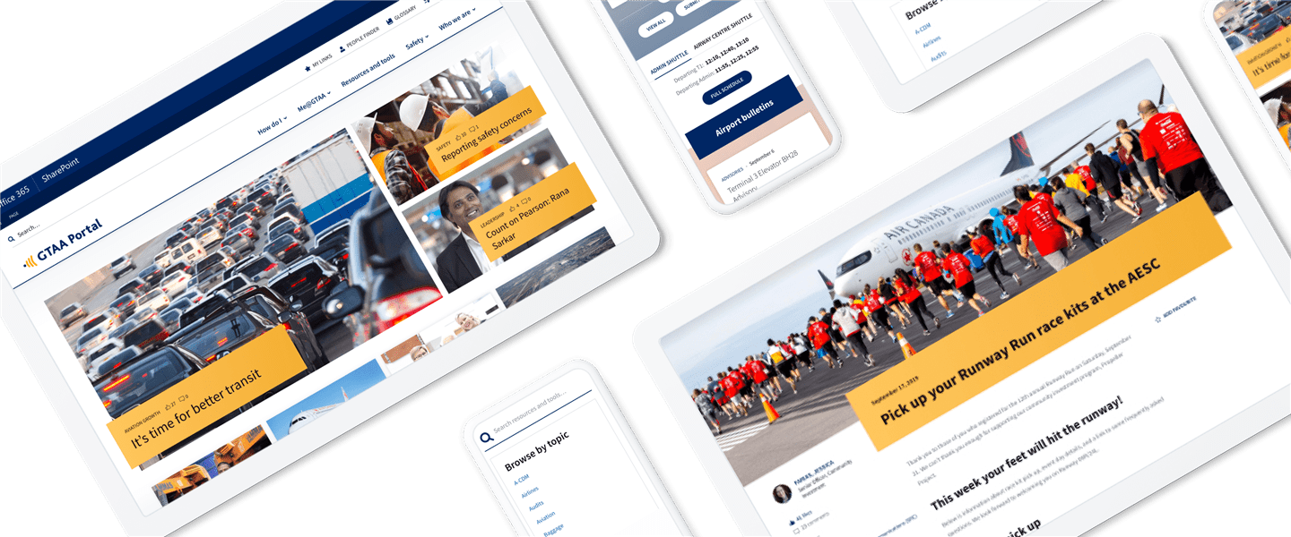
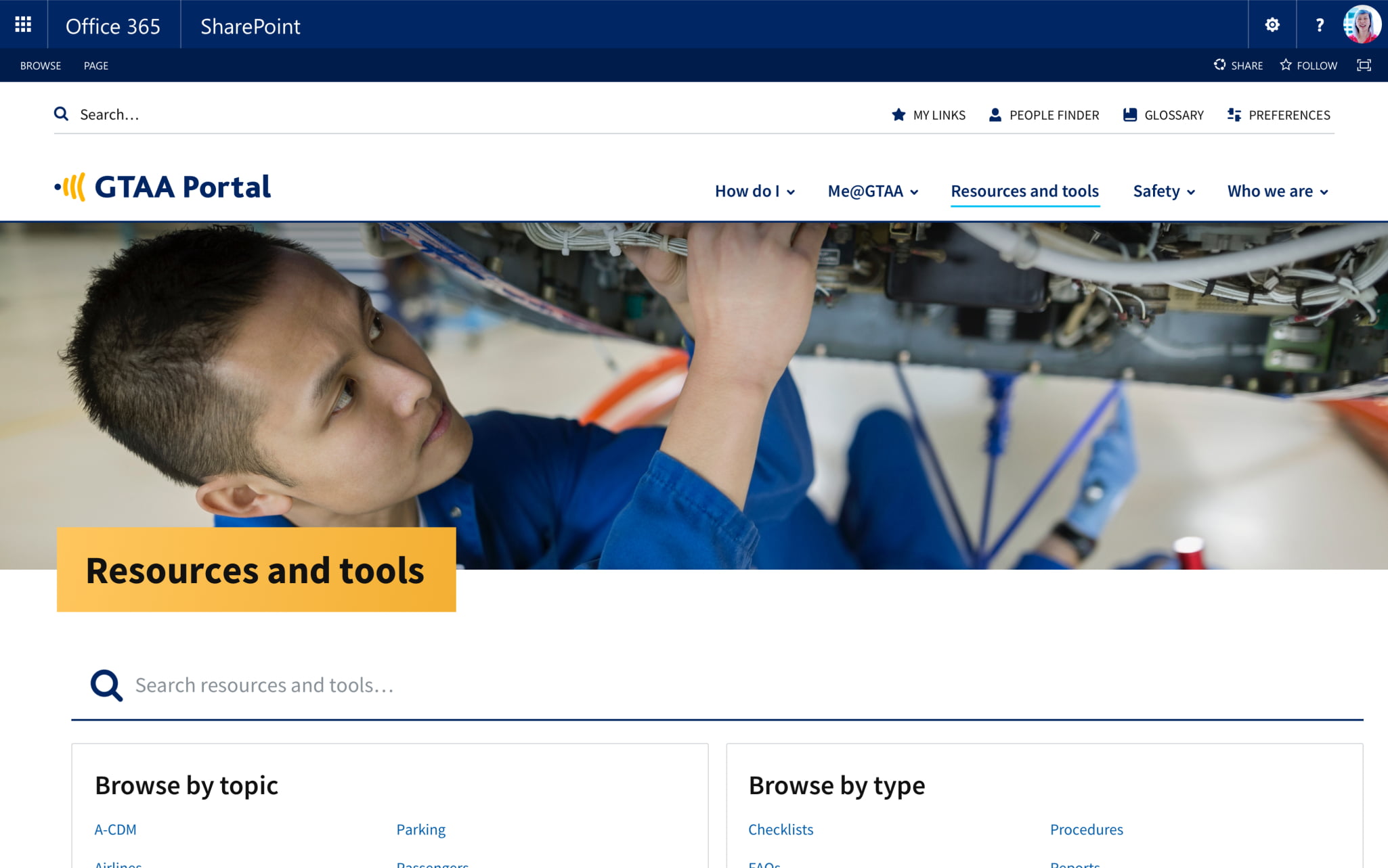
Here’s a look at some of GTAA Portal’s features:
Accessible anywhere
“One of the major wins is that the portal is available off of our network on any device so long as you can authenticate on Office 365,” says Erik. Being easily accessible from anywhere is really important, especially to GTAA’s field employees. It’s also a boon to the communications team, which rotates on-call duty to support GTAA 24/7. “It’s been a ton easier. We can publish from anywhere,” says Erik.
Improved findability
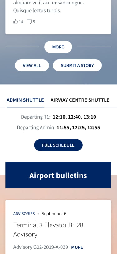
GTAA has a shuttle that taxis employees from one building to another. Given the time crunch that many employees face, we made the shuttle schedule easy to consult. “In the past, it might have taken people 10 to 15 minutes to find what they were looking for,” says Daniela. “We’re seeing a huge improvement.”
An intranet that reflects GTAA
A modern interface with a vibrant colour palette, compelling photography, and emphasis on amazing stories emerging from all corners of the organization contribute to a look and feel that is true to the GTAA’s focus on people, diversity, and accessibility.
From 1998 to 2019 in 16 weeks
While GTAA Portal’s initial launch didn't (and wasn’t meant to) solve every problem, the team had a clear picture of what launch would solve and what it wouldn’t.
“The fact that GO bound us to a tight timeline was motivating. We were like, this is happening. Let’s do the best we can. And when we launch, we’ll have a living thing. There’s nothing to say that if we missed a page, we can’t put it up. That’s a shift in thinking in this organization to continuous improvement, which we’ll take from this project and apply to our other digital properties as well,” says Erik.
GO’s strong foundation and flexibility make this shift possible.
“GO comes with a ton of teaching and knowledge transfer. Everything is designed to bring everyone to a new level of understanding about what an intranet can support in your organization,” says Ricardo.
When we asked Erik what he was most proud of about the project, he responded, “Everything. I can’t properly convey the leap that this portal has taken.”
“It’s like taking a website from 1998 to 2019 in 16 weeks,” Daniela adds. “It’s unbelievable.”



.jpg?la=en&mw=225&modified=20211119233441&hash=3EB63C1AB846505326D997AF5828D9E5F6C1D49F&hash=3EB63C1AB846505326D997AF5828D9E5F6C1D49F)
.jpg?la=en&mw=1025&modified=20211119221741&hash=8BDC67902CD6C9FBE8923A7E80AC8E5FC5D0F915&hash=8BDC67902CD6C9FBE8923A7E80AC8E5FC5D0F915)
.jpg?la=en&mw=1025&modified=20211119221752&hash=B88A8CC625C334D9BD02F4789E9CB382DA1D79CC&hash=B88A8CC625C334D9BD02F4789E9CB382DA1D79CC)


